Core Web Vitals: what they really measure (and what Google does with them)
by: Giovanni Invernizzi
28 May 2026 — Reading time: 15'
In short: the Core Web Vitals are the three metrics Google uses to measure the experience of users on your site. We explain what LCP, CLS and INP really are, why your developer’s Lighthouse score doesn’t match what Google sees, and where performance optimization intertwines with accessibility and sustainability.
Five years ago we built the first version of the website for Alex Bellini, an explorer and science communicator working on environmental sustainability. Five years later we came back for a project that was meant to showcase the blog content. It became something more: the rediscovery that performance, accessibility and sustainability are the same problem seen from three different angles. We’ll get to the numbers from that work later. First it’s worth setting things straight on something that’s often taken for granted: what the Core Web Vitals are, and what Google really does with them.
What the Core Web Vitals are and why Google insists on them
The Core Web Vitals are three metrics introduced by Google in 2020 to objectively measure the experience of users on a web page. They don’t assess content, they don’t assess design, they don’t assess traditional SEO: they assess the quality of the relationship between the site and the people using it. How quickly the page becomes useful, how stable it is while loading, how it responds when you interact with it.
Since 2021 they’ve officially been part of the signals Google considers for ranking in search results, alongside other “Page Experience signals” such as HTTPS and the absence of intrusive interstitials. The list has evolved since then: in March 2024, INP (Interaction to Next Paint) replaced FID as the third fundamental metric. The other two, LCP for loading speed and CLS for visual stability, have stayed, but with some adjustments to the thresholds and the calculation.
The three metrics, one by one
LCP, Largest Contentful Paint: how long the page takes to appear
LCP measures the time between the start of page load and the moment the main visible element on screen finishes rendering. Typically it’s the cover image of an article, the hero of a landing page, or the first block of text on an editorial page.
Google’s thresholds are clear: under 2.5 seconds is considered “good”, between 2.5 and 4 seconds “needs improvement”, over 4 seconds “poor”. Many things contribute to it: the server response time (TTFB), the weight and format of images, render-blocking web fonts, the JavaScript the browser has to process before drawing the page.
A concrete example from our work: on Alex Bellini’s site, loading was slowed down by a JavaScript library used for lazy-loading images. The library worked well, but a few years on, all the major browsers support lazy-loading natively through the loading="lazy" attribute, with no extra code needed. We removed it and added rel="preload" on the opening images to bring their loading forward. The result: pages roughly one second faster on average.
CLS, Cumulative Layout Shift: how much the page “jumps” while loading
CLS measures how much the page layout shifts unexpectedly during loading. How many times have you been about to click a link and ended up clicking a different one because an image loaded late and pushed everything down by two hundred pixels? That’s layout shift, and Google cares about measuring it because it’s one of the most concrete frustrations of the web experience.
The thresholds: under 0.1 good, above 0.25 poor. The values are dimensionless, calculated as the product of the area of the screen that shifts and the distance of the shift.
The most common causes are well known: images loaded without declared dimensions, web fonts that change the text rendering halfway through, third-party banners or widgets injected after the initial render. In our work for VolumeBK, an e-commerce with over twelve thousand products spanning books, records and courses, we brought CLS to zero: no unexpected jumps between the covers, no button moving while you’re clicking it.
INP, Interaction to Next Paint: how responsive the site is when you touch it
INP is the youngest of the three metrics. It replaced FID (First Input Delay) in March 2024, and measures the latency between a user interaction (a click, a tap, a key press) and the moment the browser shows its visual effect. Unlike FID, which assessed only the first interaction, INP considers all the interactions in the session and reports the worst one, a more realistic parameter for understanding how the site actually behaves in everyday use.
Thresholds: under 200 milliseconds good, over 500 poor. What penalizes it most are the heavy JavaScript loads that occupy the browser’s main thread and poorly written WordPress plugins that do unnecessary work on every interaction.
On VolumeBK, INP was an explicit goal: adding a book to the cart, filtering by genre, opening a record’s page, these all had to respond instantly, regardless of the fact that the catalogue contains twelve thousand items. To get there we had to rethink the search architecture: instead of querying the WordPress database on every search, we built a static index in JSON format, compressed, updated in batches when the catalogue changes. It’s an example of how optimizing sometimes means rebuilding, not just speeding up.
What Google really does with these numbers
Here’s the part many Core Web Vitals guides skip. The numbers you see when you open Lighthouse or PageSpeed Insights and analyze a page from your computer are lab data: measurements taken under controlled conditions, on a simulated device, at a single instant. They’re useful for developing, debugging, figuring out where to act. But they aren’t the numbers Google uses to rank you.
The numbers that count for ranking are the field data: real measurements collected through the Chrome User Experience Report (CrUX), aggregating the experience of visitors who actually browse the site with Chrome. Real connections, real devices, real conditions. That’s why two sites can have the same Lighthouse score and rank differently: one has users on Italian fibre, the other has an audience on the move on unstable 4G, and the real numbers tell two very different stories.
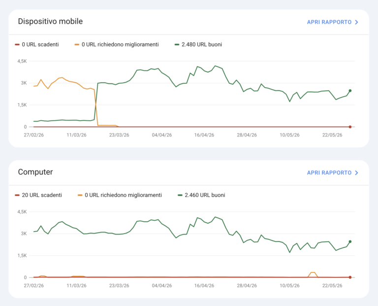
Core Web Vitals report from Search Console for volumebk.it.
The other thing worth clarifying: the Core Web Vitals aren’t the primary ranking factor. They’re a tie-breaker. With content of equal relevance, a page with good Core Web Vitals beats one with poor metrics. But a high-performing page with weak content will never overtake a slow page with content far more relevant to the query. Chasing 100/100 on Lighthouse at the expense of the editorial work is one of the most common mistakes we see people make.
Optimization doesn’t start with the code
Most articles on the Core Web Vitals focus on micro-optimizations: compressing images, minifying CSS, removing unused JavaScript. Right things, but they come later. The performance of a WordPress site is decided first of all by architectural choices made at the start of the project.
Hosting is the first factor. A slow or overloaded server will give a high TTFB (Time to First Byte), and no front-end optimization will recover that delay. On VolumeBK, where twelve thousand products need to be served with traffic peaks tied to events and editorial launches, we chose Kinsta as our hosting partner, leveraging the integration of Edge Caching and CDN to serve static content with minimal latency.
The WordPress theme is the second. A “do-everything” theme full of features you’ll never use brings with it hundreds of KB of CSS and JavaScript the browser still has to process. Our proprietary technology infrastructure, Flying, is designed to cut that weight at the source: a lightweight theme, surgically chosen plugins, no accumulated technological inertia.
Plugins are the third. Every active plugin is code that runs, queries that get made, hooks that get called. A WordPress site with thirty-five plugins will almost always be slower than one with twelve, regardless of what they do. The question to ask before installing a plugin isn’t “do I need it?”, but “is it worth the permanent cost of having it in the stack?”.
A very popular shortcut for LCP (and why we use it with caution)
A concrete example of an optimization that seems right but can turn out to be short-sighted: to improve LCP, many guides recommend placing the CSS needed for the above-the-fold content directly in the page’s <head>, the so-called critical CSS. This way the browser doesn’t have to wait for a separate request for the stylesheet and can start rendering the visible part of the page right away.
It works, on the first paint. It works less well on everything else.
CSS loaded as an external file via <link rel="stylesheet"> is downloaded only once: from the second page onwards the browser uses the cached copy. Inline CSS in the <head>, on the other hand, is part of the HTML itself: it’s transmitted on every page request, even if it’s identical from one page to the next. For a user who browses ten pages of the site, that’s ten downloads of the same payload. Multiplied by thousands of visitors, it becomes an amount of bandwidth, and therefore of energy, that weighs more than the millisecond gained on the initial LCP.
At PaperPlane we use inline critical CSS only where it genuinely makes sense: very high-traffic pages where the gain on first render justifies the cumulative cost. For everything else we prefer well-structured external CSS files, cached by the browser, served from a CDN. It costs a few more milliseconds on the LCP of the first visit, but over the site’s entire lifecycle it’s a choice that weighs less on the servers, on the network and on the planet.
It’s exactly the kind of reasoning that gets lost when you focus on the Lighthouse score of a single page instead of the real experience of visitors across the whole site.
Performance, accessibility and sustainability are the same problem
Back to Alex Bellini. When we worked on his site, the initial goal was to showcase the blog. Measuring the starting state with Lighthouse and axe DevTools, we found a Performance score of 68%, an SEO score of 92% and 87 accessibility issues. After the work: 97% Performance, 100% SEO, zero accessibility issues. The three dimensions improved together because in many cases they’re treated together.
A fast site is a site that someone on a slow connection can still use. Semantic headings and well-written alt text serve the screen reader and Google in equal measure. Loading fewer resources means consuming less energy: websitecarbon.com tells us that PaperPlane’s site consumes between 50% and 90% less than the average website, not out of abstract environmental virtue, but because every KB saved is a KB that doesn’t get served, downloaded, decoded.
The companies that took web accessibility seriously discovered this first: the work done for people using assistive technologies improves SEO, reduces loading times, lightens the environmental footprint. It isn’t a coincidence. It’s the same work called by three different names.
Where to start if you have a WordPress site to improve
Four concrete steps, in order.
First: look at the real data, not the lab data. Open Google Search Console and go to the “Experience” → “Core Web Vitals” section. Those are the numbers Google sees on your users, collected via CrUX. From there you understand whether you have a real problem or whether Lighthouse is just scaring you.
Second: identify the right pages. Not the home page, almost never. The pages to optimize first are the ones with the most organic traffic, because the impact on ranking shows up where users actually land from Google. For e-commerce sites these are often the product pages or the most searched categories; for editorial sites, the most-read evergreen articles.
Third: do a serious audit, not just an automated one. Lighthouse and axe DevTools are starting points, not finishing lines. Automated tools find obvious problems but miss the nuances: a removed JS library, a font loaded differently, a rethought image can be worth more than a thousand automated suggestions.
Fourth: prioritize by impact, not by ease. The temptation is to start with the quick fixes. But if the real problem is the hosting, compressing another twenty images won’t move the needle. Measure where the bottleneck is first, then act.
When it’s worth asking for help
Optimizing the Core Web Vitals of a WordPress site without redesigning it is work that can be done in phases: audit, targeted interventions, measurement of results. On many of our clients’ projects the gain comes from the first two or three right interventions, not from hundreds of accumulated micro-fixes.
If you want to figure out where to start, at PaperPlane we offer a free thirty-minute call dedicated to web performance and digital sustainability. We tell you what we see looking at your real data and what margin for improvement seems concretely achievable to us. Without any promise of 100/100 on Lighthouse: what we care about are the numbers that actually shift something for your users.