Visual identity, content design and WordPress website for an AI cognitive governance model
A visual identity and a website that speak about AI governance to enterprise companies
AISMA is a research and technology transfer centre accredited by Unioncamere/MIMIT and recognised as a training body by Regione Lombardia: for over ten years it has supported companies and organisations in the responsible adoption of artificial intelligence, with a team of researchers, data scientists and PhDs in mathematical and statistical disciplines.
For us at PaperPlane, the project was far more than a simple restyling: visual identity, content design and the WordPress website had to work together to convey an offering that is hard to grasp at a glance (a cognitive governance model, not just another AI product), speaking the language of decision-makers without losing credibility in the eyes of those who assess the technical infrastructure.
Request
AISMA needed to reposition itself in the eyes of non-technical CEOs and CTOs: to present an AI cognitive governance model without making it look like yet another tool or software platform.
Result
A website that speaks two languages in the same space: that of responsibility and risk for those who decide, and that of technical detail for those who examine the infrastructure up close, without the two levels ever blurring — the same duality that the organic visual identity makes recognisable at a glance.
The context
Building the message: making the concept of AI governance clear to a C-level audience
When we started working with AISMA, the brief was to reposition the company around the concept of the “Cognitive Enterprise” (Impresa Cognitiva). AISMA does not sell a software platform: it sells an organisational model for governing artificial intelligence within companies and turning corporate know-how into a reusable asset.
The central challenge of the project starts here: making an abstract concept like AI governance clear in a few seconds, with the big picture for those who decide and the technical detail for those who evaluate.
UX and Content Design
Content design: an information architecture with two reading levels
We designed a content architecture with two reading levels.
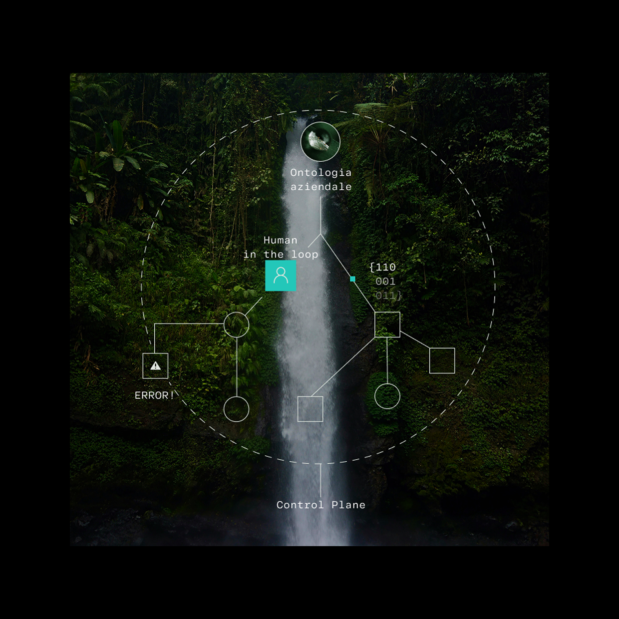
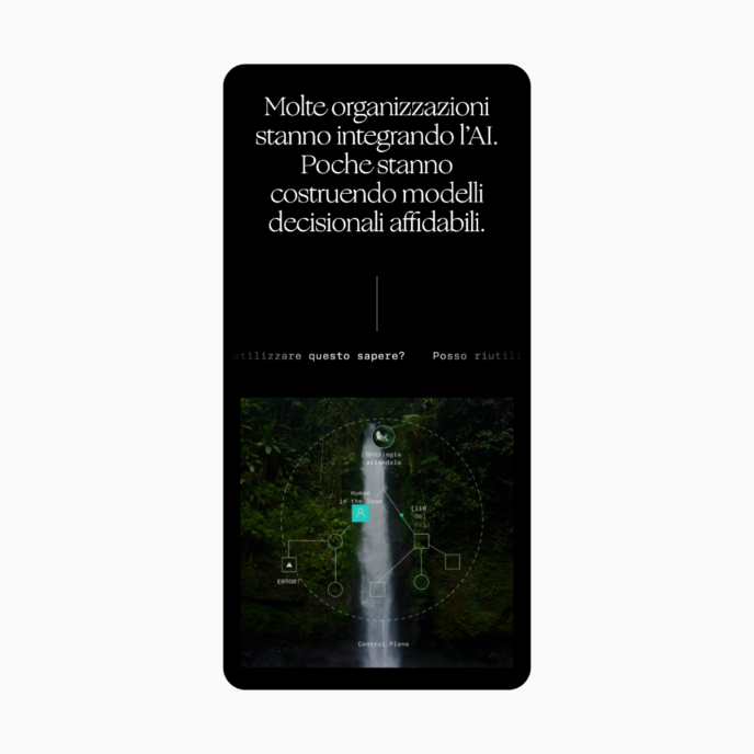
The homepage stays abstract and strategic: it presents the model and its three pillars — enterprise ontology, human oversight, Control Plane — and keeps the proprietary technology in the background.
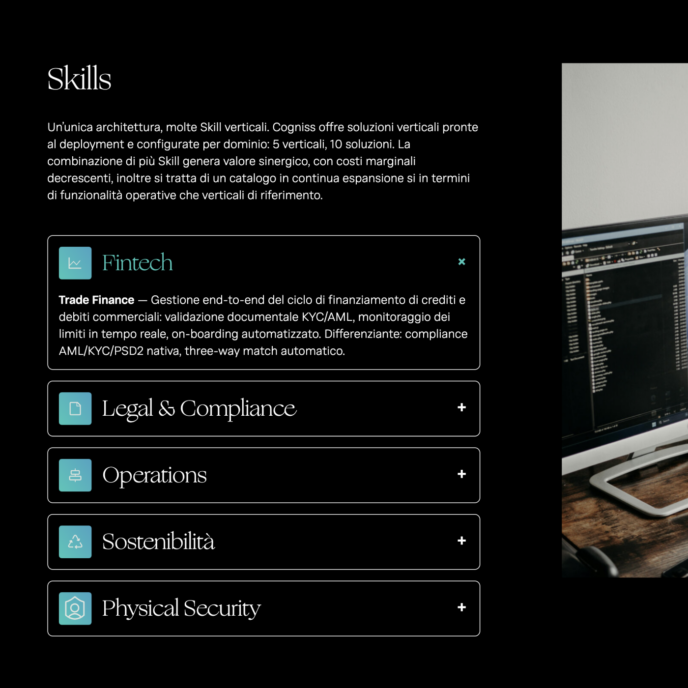
The Cogniss page, by contrast, goes into technical detail, with features listed directly rather than told as a story. Every section also puts the problem before the solution — a block devoted to four concrete risks, from hallucinations to vendor lock-in, comes before the presentation of Cogniss’s eight operational deliverables — so readers first recognise their own problem and only then meet the answer.
Brand and UI
The visual identity: an organic imagery to govern complexity
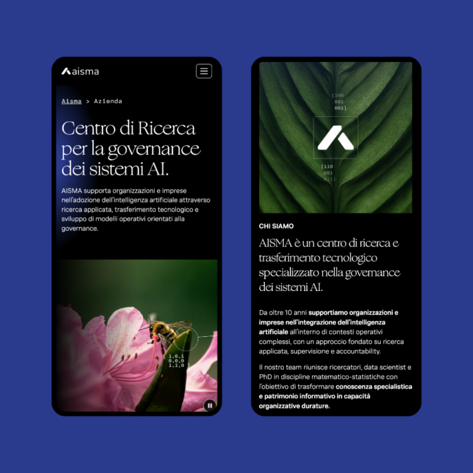
The interface directly inherits the work done on the brand: the same visual identity, applied to the website, brings to the surface the tension that the copy resolves in words.
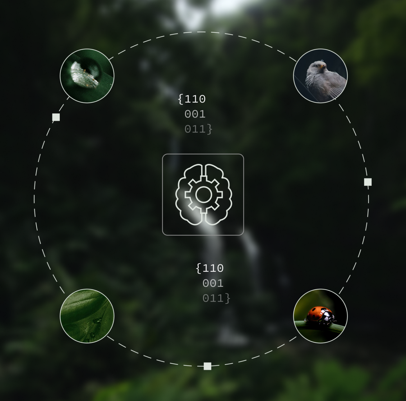
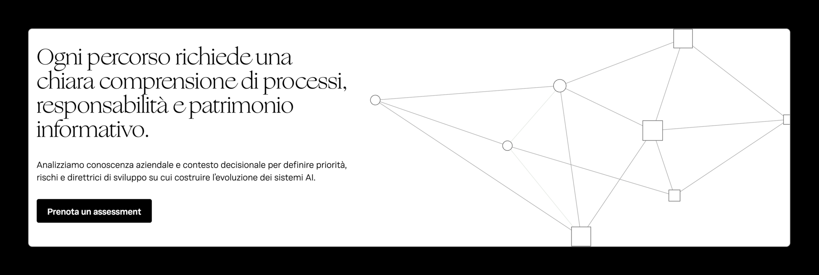
The concept, “Organic Logic” (Logica Organica), stages nature — forests, waterfalls, ferns, living and not-yet-structured elements — as an image of raw corporate knowledge, overlaid with a grid of nodes, coordinates and vector lines that represents governance: the rational part that measures, maps and disciplines that complexity.
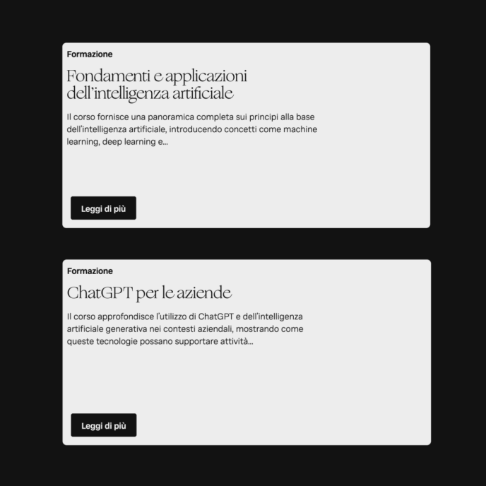
The typography follows the same dual logic: an elegant italic for headlines that gives the narrative room to breathe, paired with a clean sans-serif where technical clarity is needed. The palette keeps a sober, enterprise register, far from the blues and violets of AI startups that the target audience has grown used to, consistent with positioning as a strategic partner rather than a tech product.
Development
The WordPress website: a custom foundation, built with Flying to evolve over time
The website was developed with our Flying framework on the WordPress infrastructure: a technical foundation designed to give full control over the platform, without relying on third-party plugins that would limit its flexibility and stability over time. This approach allows us to build tailor-made automations for each project, deliver solid performance from the first release, and step in quickly when the site needs to evolve alongside the client’s business.
Scopri altri casi studio
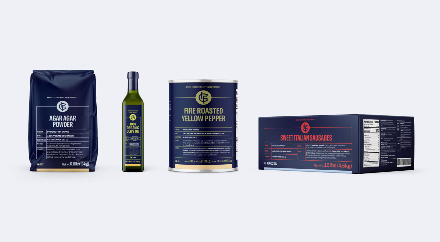
IGF | Brand IdentityStrategy
Qualitaly | Brand IdentityStrategy