Gimme5 Wins at the DX Awards: our accessibility work
by: Laura Molena
1 July 2026 — Reading time: 11'
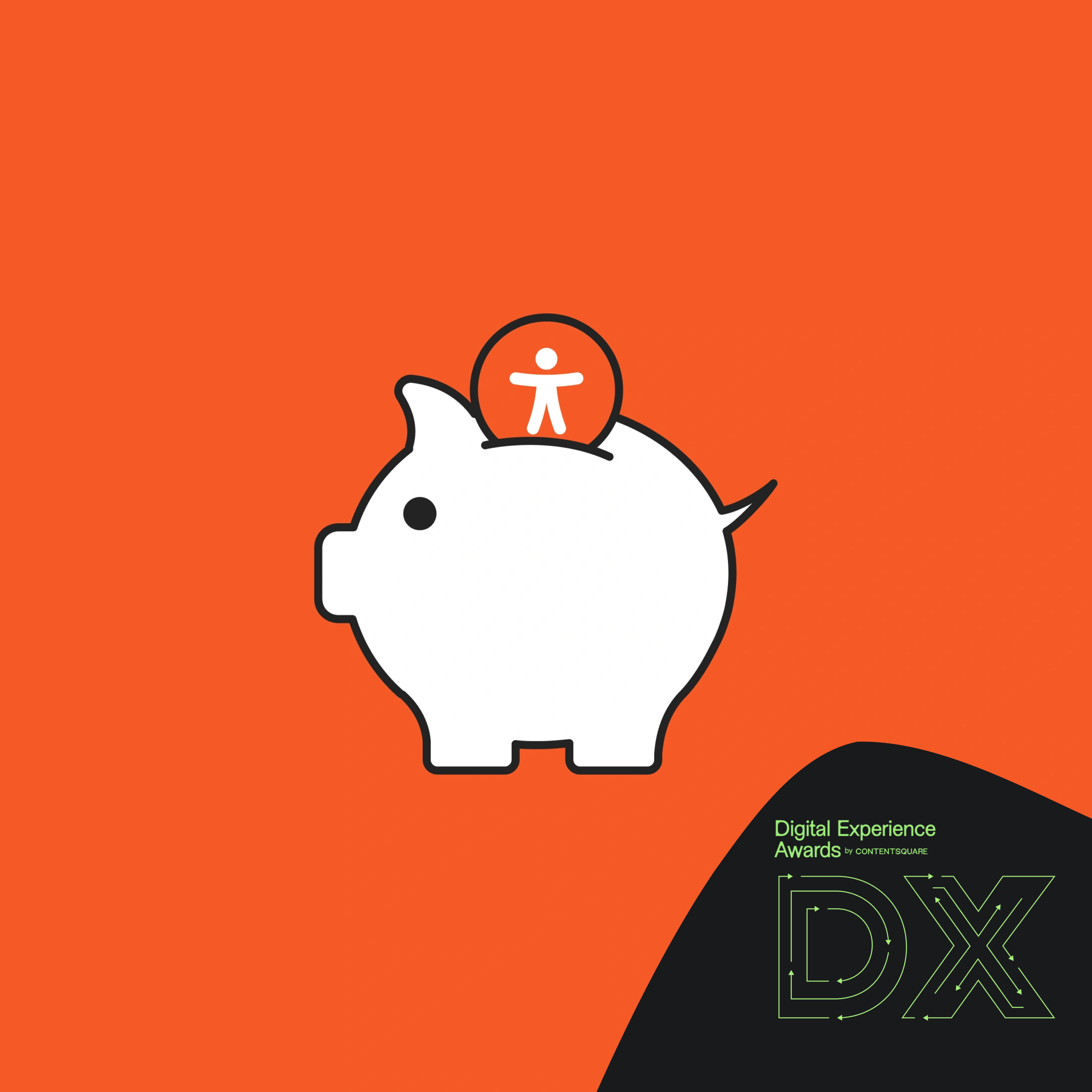
In short: on 25 June 2026, at the Digital Experience Awards by Contentsquare, the website we designed and built for Gimme5 won the Best Digital Accessibility Mission award. This isn’t a stamp on a box-ticking compliance exercise: it confirms two things we believe in. Accessibility, when it enters the design from the very start, becomes a brand value rather than an aesthetic compromise. And a solution built for a few people, like the fund charts turned into readable tables, often ends up making information clearer for everyone.
When Gimme5 came to us, the brief and the worry were the same thing. Bring the site in line with the European Accessibility Act, yes, but without losing the visual identity that makes the brand recognisable: the palette, the components, the tone. The perceived risk was that accessibility would sand away everything that made Gimme5 itself. As the work we did on the accessible Gimme5 website shows, we took that worry and turned it into an opportunity.
On the evening of 25 June 2026, at the National Museum of Science and Technology in Milan, that turnaround had a public payoff.
What the Best Digital Accessibility Mission rewards
The Digital Experience Awards by Contentsquare reward projects that put accessibility, inclusion and simplicity at the centre of the digital experience. In the accessibility category, Gimme5 was in good company: the shortlist also featured Amplifon and the University of Bologna. Winning the Best Digital Accessibility Mission in that context means something precise. It means proving that digital accessibility and financial accessibility can grow together, instead of getting in each other’s way.
The fact that accessibility has a category of its own, in an award dedicated to digital experience, is a signal in itself. In Italian fintech it is still too often seen as a box to tick to avoid penalties, a cost to contain. This recognition tells a different story: investing in accessibility means building a better product, for a wider audience. It’s the reading we share, and the one the Gimme5 project puts down in black and white.
Digital accessibility and brand: the European Accessibility Act challenge
The starting point was the European Accessibility Act, the EU directive that requires many digital products and services to be accessible to people with disabilities. For a financial service like Gimme5, which lets people save and invest straight from the app, this was no detail to leave until the end: it meant reviewing the site against the WCAG 2.1 AA success criteria and the UNI CEI EN 301549 technical standard.
In cases like this, the temptation is to treat compliance as a checklist. We work differently: accessibility is part of how we design accessible digital products, not a coat of varnish applied at the end. And for Gimme5 the stakes weren’t compliance in itself, but making it live alongside a strong identity, without asking the brand to step aside.
Accessibility doesn’t take away, it adds
This is the heart of the story, and also the most counterintuitive part. Optimising the palette for adequate contrast, redefining the typographic hierarchy, designing visible focus states, adding a way to switch off animations: these are changes that, to anyone without specific needs, stay almost invisible. Yet they didn’t dilute the brand. They made it more solid, more legible, more consistent on every screen.
The clearest case involves the investment funds. The interactive charts, generated in real time with Chart.js from JSON data, were the informational core of the site, but they weren’t readable by anyone navigating with a keyboard or using a screen reader. Rather than overhaul the existing infrastructure, we built a parallel alternative: the same JSON data becomes accessible tables, with a date column and a value column, accompanied where useful by a summary of the fund’s performance.
The surprise came afterwards. That table, born to solve a problem for a few people, made the numbers easier to grasp for everyone, not just for those using assistive technologies. Technical accessibility and cognitive accessibility overlapped in a very concrete way. It’s the same idea that Giuseppe Codazzi, Product Manager at Gimme5, summed up when receiving the award: accessibility and product quality are not in tension, they reinforce each other.
Behind the scenes: how we got there
We didn’t get there by intuition, but by method. The project started with an audit made of real manual testing: keyboard navigation, screen readers, zoom features. Automated tools alone aren’t enough, because many barriers only show up when you try to use the site the way a person with assistive technology would. From there came two parallel documents: a narrative report for the people who had to decide, and a technical document listing every non-conformity and its fix.
The decisive part, though, is upstream. Almost 70% of accessibility problems originate in the design, so that’s where we worked before writing a single line of code. On the development side we used Flying, our WordPress blank theme, which builds in semantic relationships and accessible components by default: a way to build reliable, high-performance and accessible digital products without chasing manual fixes after every content update.
From FAQs to meaningful links: the changes you notice most
Some choices are small to describe and large in daily use. In the support section we rethought the path before the interface itself, adding shortcuts like “skip to frequently asked questions” and a search with clear labels, so that reaching a piece of information doesn’t mean crossing the whole page. On dynamic content we made the calls to action contextual: a generic “read more” automatically becomes “read more about fund X”, which for a screen reader user is the difference between a list of identical links and a list that makes sense. And during quality assurance we put several hours into exactly these refinements, because it’s in the detail that accessibility is really felt.
A real limit: the table isn’t the chart
Being honest is part of how we work, so we’ll say it: the accessible table solves the readability problem, but it doesn’t give back the visual immediacy of an interactive chart. It’s the right choice given the technical constraint, and the best one possible without rewriting the whole infrastructure, but it stays a compromise, not a magic wand. On projects where the visualisation is the central value, it would be worth budgeting for natively accessible charts, with the time and money they take.
There’s a second, subtler limit. An audit is a snapshot of one moment. A site lives, changes, fills up with new content, and every new piece of content can reintroduce a barrier the audit had closed. Accessibility isn’t a finish line you cross once: it’s a form of maintenance. That’s why we don’t promise perfect, forever-valid compliance, but a commitment to keeping it high over time.
For Gimme5, digital and financial accessibility are the same work
Gimme5 talks about accessibility on two levels. The digital one: a site and an app that work for anyone, including people with visual, motor or cognitive disabilities. And the financial one: you can start saving and investing from 1 euro, in small steps over time. The two levels are inseparable, because a service that shuts someone out keeps them away from investing before they can even begin to understand it.
A parallel principle holds for us. Accessibility, performance and readability don’t live in separate compartments: a site built well for someone using a screen reader is almost always a clearer site for Google and for generative engines too. It’s the ground where accessibility and SEO reinforce each other, and where work done for people brings benefits no one explicitly asked for.
Then there’s the more concrete return, the one that often convinces even the sceptics. The optimisations made to the design system are invisible to those who don’t need them, but for those who would otherwise be left out they’re the difference between using the service and not being able to use it at all. Making a site accessible means widening the pool of people who can inform themselves, understand and decide: a competitive advantage, not a cost line. For a service that runs on trust, like a financial one, that’s anything but a detail.
Where to start if you have a site to bring into line
If you have a site that needs to become accessible, these are the first steps we recommend, in the order that matters.
- Start with an honest audit, done by hand and not only with automated tools: it’s the only way to understand what a person using assistive technology actually experiences.
- Look at the design system before the code, because that’s where most barriers are born, from contrast to focus states to form labels.
- Involve development from the outset, so accessibility enters the logic of the site instead of becoming a series of patches applied afterwards.
- Treat it as a process, with regular checks on new content, and not as a certificate to frame once and forget.
If you want to start on the right foot
The award to Gimme5 wouldn’t have come without the trust and openness of their team, in particular Andres Felipe Pardo and Fabio Arlati, who accompanied every stage with enthusiasm and a spirit of collaboration [DATA: if you like, add who collected the award for Gimme5 or a brief memory of the evening for a personal touch]. It’s the kind of work we love to do: deep, shared, with a result you can see and one you can feel.
If you have a site to bring in line with the European Accessibility Act and you don’t want to lose what makes you recognisable, we can look at it together. We offer a thirty-minute call on digital accessibility to work out where you stand and where it makes sense to start. No promises of instant compliance: first we understand your site, then we talk about how to make it truly accessible.