Gimme5 Wins at the DX Awards: our accessibility work
On 25 June 2026, at the Digital Experience Awards by Contentsquare, the website we designed and built for Gimme5 won the Best Digital Accessibility Mission award.
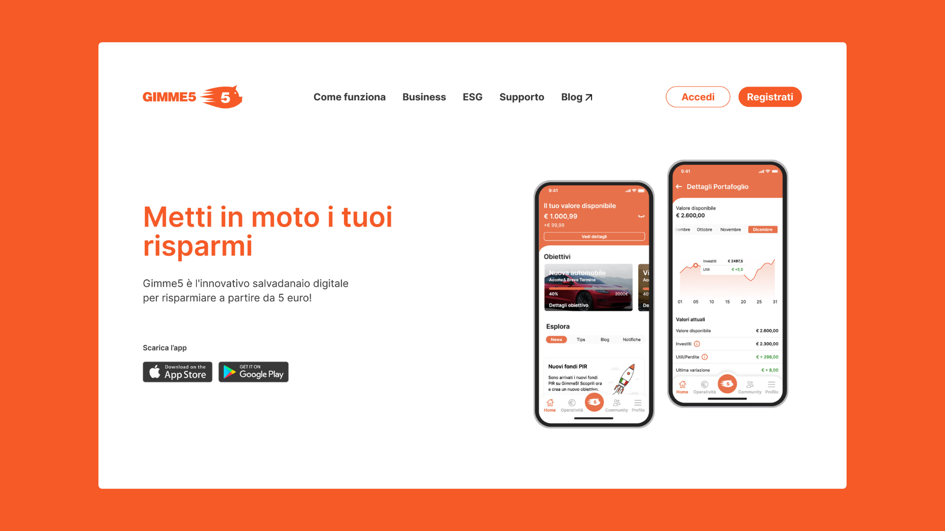
Gimme5 is the digital service by AcomeA SGR that allows users to save and invest through its app.
The challenge was clear: to align the main website with European accessibility standards ahead of the entry into force of the European Accessibility Act. For Gimme5, it wasn’t just about regulatory compliance, but about opening its services to everyone, without barriers. The concern? That the intervention might compromise a visual identity built on a distinctive color palette and established graphic components.
Our task was to transform that concern into an opportunity: to demonstrate that accessibility and identity can strengthen each other, without aesthetic compromises.
Request
Make the website compliant with the European Accessibility Act while keeping the brand identity intact.
Result
An accessible, usable, and consistent website with Gimme5’s image, transforming regulatory compliance into a strategic advantage.
The Google Analytics data collected in the thirteen months following the launch confirm that accessibility and quality of experience moved forward together. Session engagement rate — the share of visits that translate into real interaction with the content, rather than an immediate bounce — grew consistently across all major browsers and markets, surpassing 98% on average. Over the same period, new visitors increased, use of the internal search grew significantly, and new video content was introduced, while document downloads remained stable. A consistent signal: a site designed to be accessible to everyone ends up being, simply, a better site for everyone.
| Metric | Before (Jun 2024 – Jul 2025) | After (Jun 2025 – Jul 2026) | Change |
|---|---|---|---|
| Average engagement rate (all browsers) | 95.7% | 98.6% | +2.9 points |
| Engagement rate – Chrome | 94.8% | 98.0% | +3.2 points |
| Engagement rate – Safari | 96.5% | 99.4% | +2.9 points |
| Engagement rate – users in Italy | 96.7% | 98.5% | +1.8 points |
| New users (daily average) | 136.8 | 148.3 | +8.5% |
| Users using internal search | 12 | 1,031 | +8,492% |
| Document downloads | 154 | 124 | -2.5% (stable) |
| Video content starts | 0 | 294 | newly introduced content |
Analysis and Audit
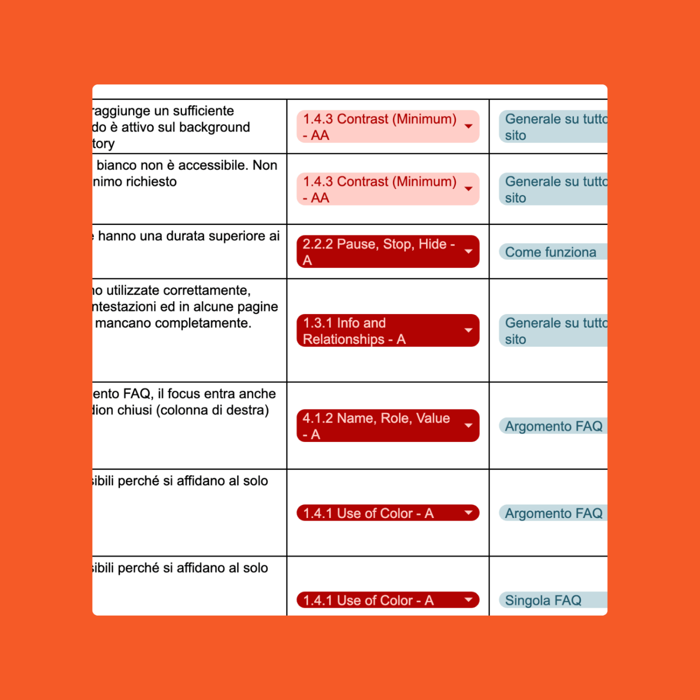
The project began with a phase of in-depth manual testing, carried out through keyboard navigation, the use of screen readers, and magnification functions, to directly evaluate the experience of people using assistive technologies. These tests made it possible to identify concrete navigation and content comprehension issues that are difficult to detect by automated tools alone. In parallel, automated and semi-automated checks were also performed, providing a complete technical snapshot of the website’s status.
We produced two parallel documents: a narrative report, designed for non-technical stakeholders, and a technical document detailing all non-conformities, explanations, and best practices.
At the same time, we analyzed the design system and the modules present on the site, cataloging colors, typography, and components. This allowed us to highlight how many critical issues stemmed directly from recurring design patterns: insufficient contrasts, non-semantic headings, links identified only by color, forms without labels, lack of mechanisms to disable animations, and non-accessible sliders. A mapping that provided the client with a clear vision not only of the website, but of the entire Gimme5 visual ecosystem.
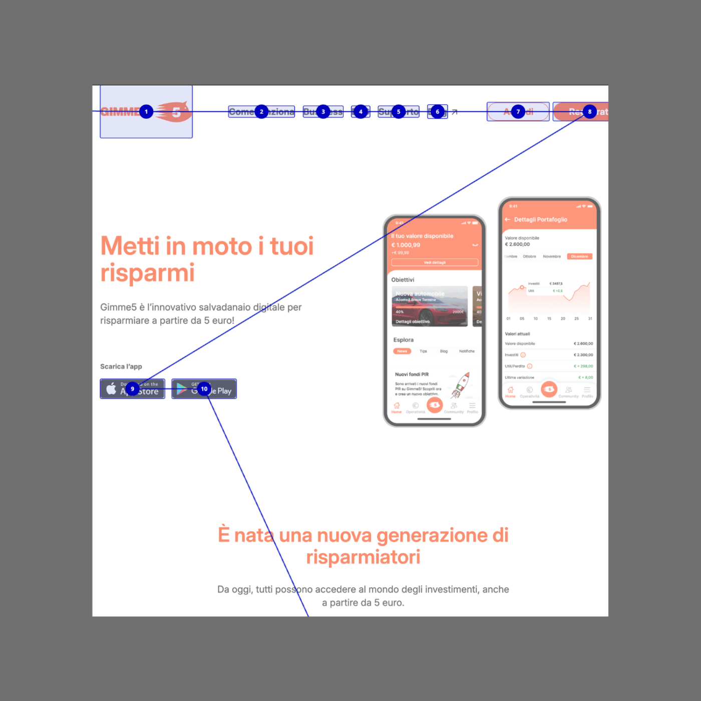
Accessibility by design
We know that nearly 70% of accessibility issues stem from design. That is why our work started there.
We optimized the color palette while keeping the brand tone recognizable, and redefined the typographic hierarchies to ensure adequate contrast and clearer reading, in line with the latest UNI CEI EN 301549 technical standard requirements and WCAG success criteria.
New focus states were designed, the navigation menu was made accessible, a mechanism to disable animations was introduced, and forms and search functions were revised for immediate and clear use. Every intervention strengthened the overall usability, transforming content discovery into a more intuitive and accessible journey.
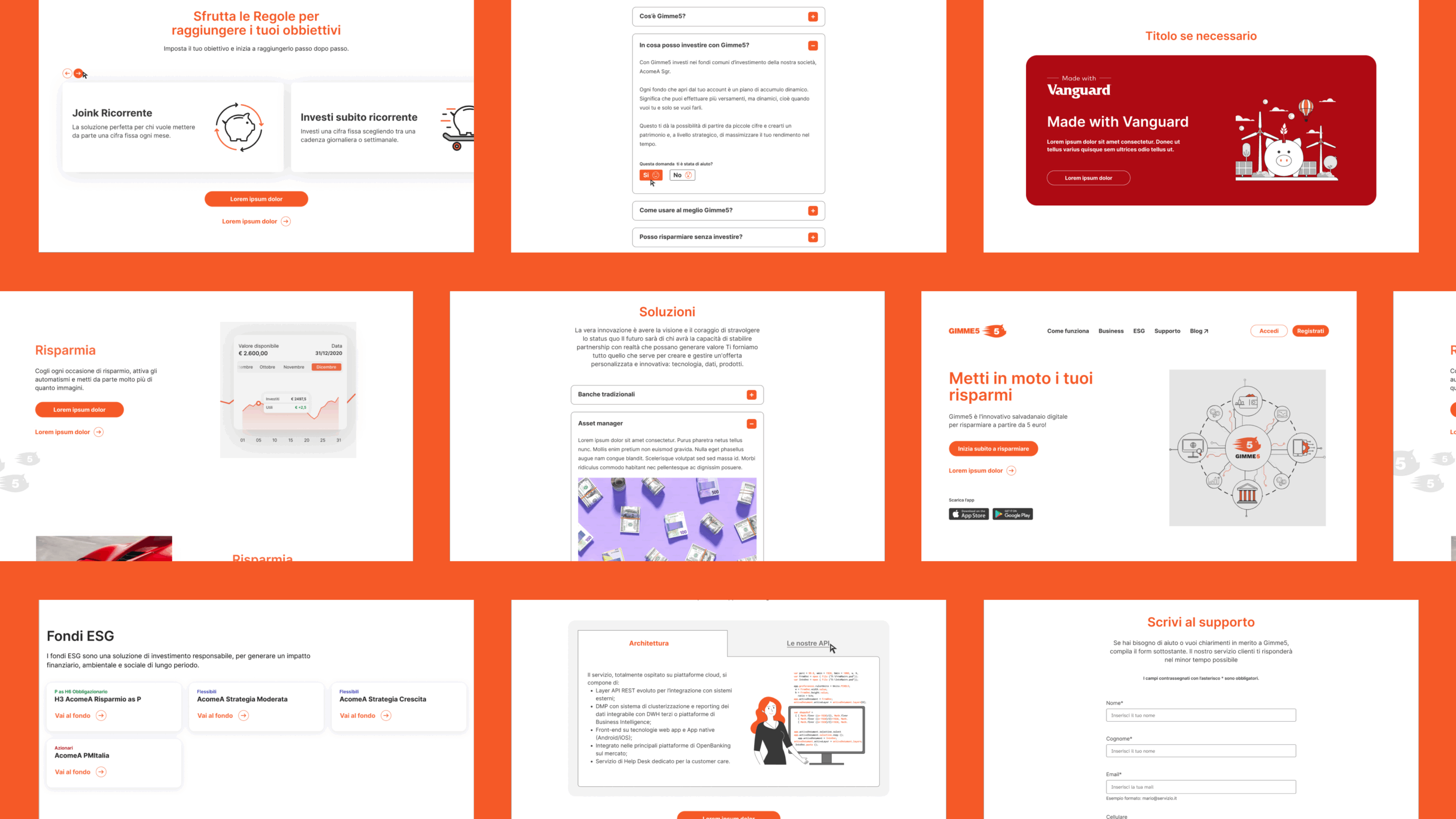
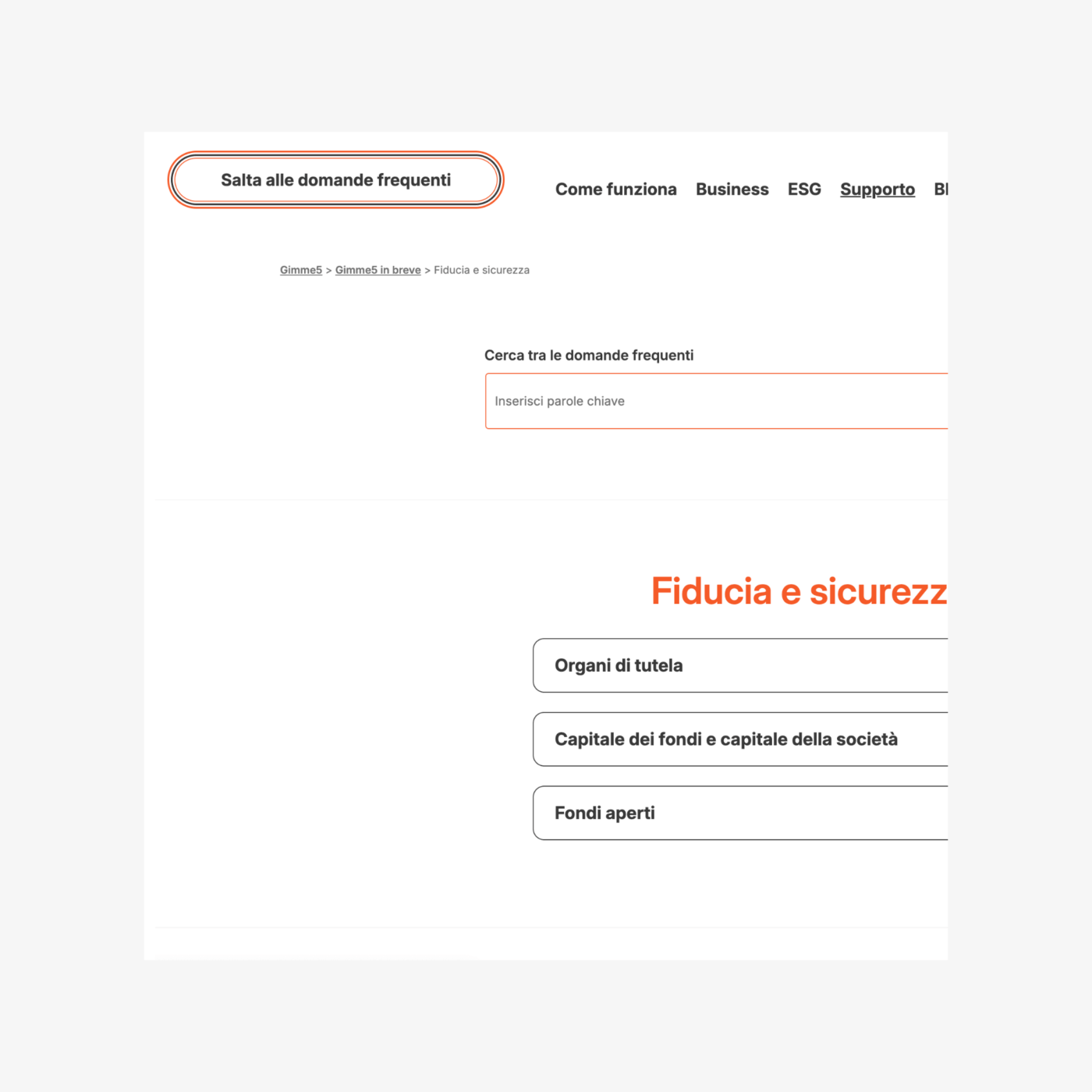
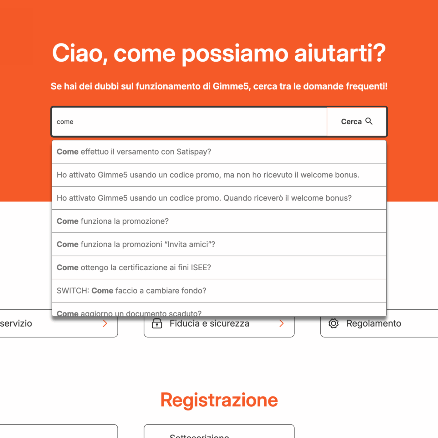
One of the most significant interventions concerned the support section. Here, the focus was not primarily on the user interface, but on the user journey: how to quickly reach the necessary information? We revised the section’s architecture, added shortcuts such as “skip to frequently asked questions,” and made the FAQ content immediately accessible even to screen reader users. A concrete example of how accessibility and user experience can go hand in hand.
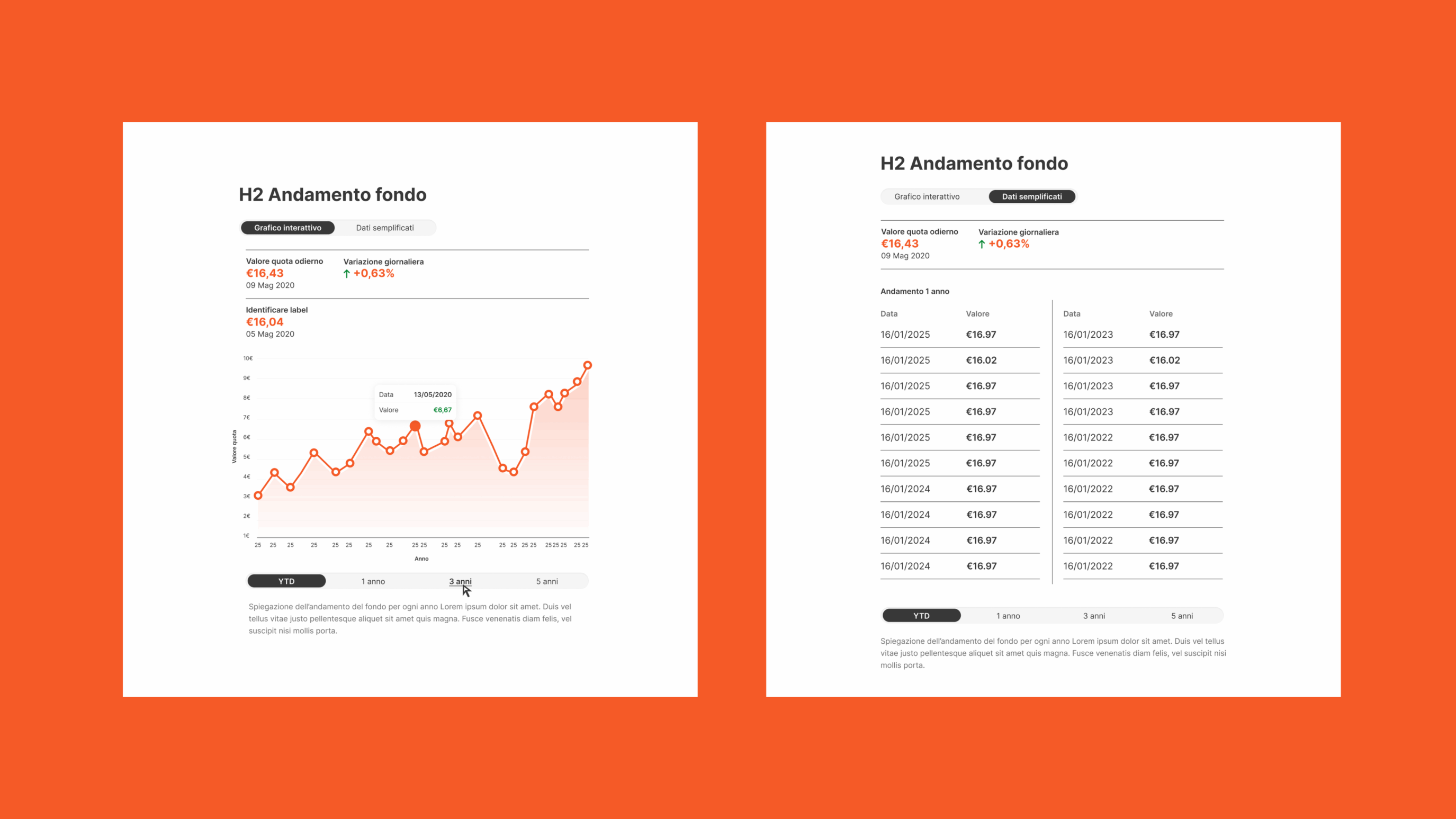
The section dedicated to investment funds presented a further challenge. The interactive charts, the information heart of the site, are generated in real-time starting from JSON data provided by Gimme5 and use Chart.js. An effective system but with one limitation: the charts are not compatible with accessibility requirements, specifically regarding keyboard navigation and screen reader output.
To address this technological constraint without overturning the existing infrastructure, we designed a parallel alternative: the JSON data is transformed into accessible tables, with date/value columns, enriched with a concise description of the fund’s performance if necessary. In this way, every user can read and understand the information independently, with equal opportunity for choice and decision-making.
Accessible development
Once the design phase was completed, we prepared a detailed handoff for the development team, with the goal of integrating accessibility directly into the site’s logic, without having to resort to continuous manual corrections during content management.
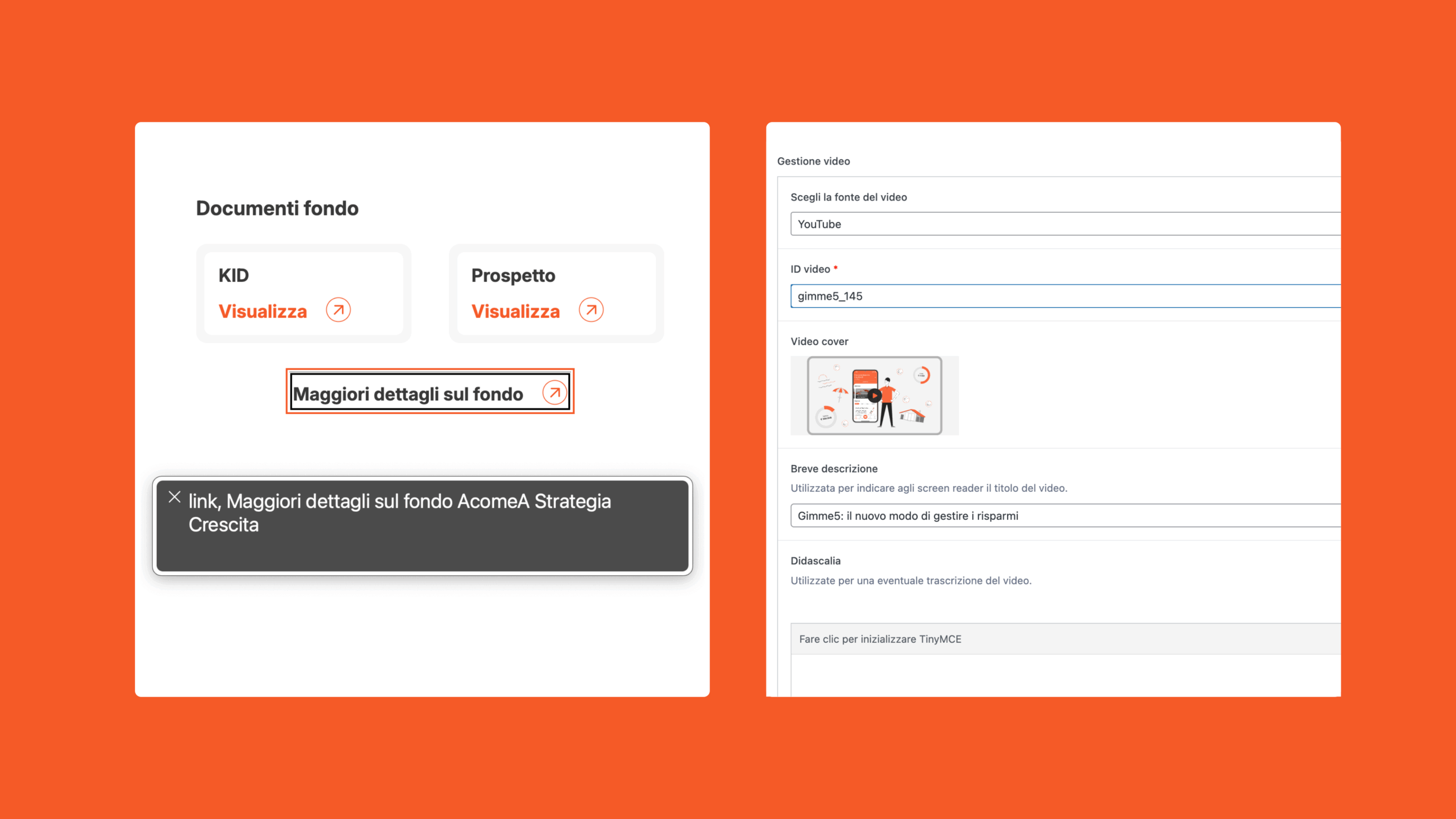
We defined automatic semantic relationships between headings and sections, set up mechanisms to make CTAs always contextual (“read more” automatically becomes “read more about fund X”), and created dedicated fields for screen readers to add ancillary information only when necessary.
The development was carried out using Flying, PaperPlane’s WordPress blank theme, which allows these optimizations to be incorporated by default, ensuring optimal performance, SEO, and accessible components that comply with the latest UNI CEI EN 301549 requirements and WCAG. The constant collaboration between designers and developers made it possible to transform design guidelines into a coherent, scalable, and accessible ecosystem.
During the debug and Quality Assurance phase, we invested several hours in refining the elements most relevant to those using assistive technologies.
We revised labels, added accessible tags, and clarified the meaning of interactions and components, so that screen reader navigation would be fluid and understandable. This refinement allowed us to further raise the level of accessibility, demonstrating how attention to detail makes the difference in the final experience.
Beyond compliance
The new Gimme5 website demonstrates that accessibility is not a constraint for a brand’s aesthetic appearance, but can represent a strategic and competitive advantage. The optimizations carried out on the design system are “invisible to the eye” for those without specific needs, but fundamental for those who otherwise would not have been able to access the content.
The project allowed Gimme5 to offer a more accessible and inclusive experience, expanding the target audience and the informational reach of the site.
Such an in-depth job would not have been possible without the availability and trust of the Gimme5 team. A special thanks to Andres Felipe Pardo, Strategic Designer, and Fabio Arlati, Lead Developer, who accompanied every stage of the journey with enthusiasm and a spirit of collaboration.
AroundTheBlue | Brand IdentityWebsitesStrategy
LAND | Websites