Skip to content

Building Consistency in a Complex Ecosystem

Olinda is much more than an organization: it is an ecosystem that intertwines job placement, culture, catering, hospitality, and urban regeneration within the spaces of the former Paolo Pini psychiatric hospital in Milan. A living system composed of diverse entities such as Jodok, OstellOlinda, TeatroLaCucina, and the “Da vicino nessuno è normale” festival—each with its own identity, yet all part of a common vision.

The challenge was not just to design new websites, but to give shape to a complex ecosystem, making its relationships, goals, and tools legible. Through a series of workshops and analysis, we worked alongside the Olinda team to build a shared vision and define a digital strategy capable of holding different identities together without losing consistency.

On these foundations, we designed and developed a WordPress Multisite system based on the PaperPlane Flying infrastructure, designed to support the ecosystem’s growth while maintaining recognition, autonomy, and long-term sustainability.

Request

Build a digital strategy capable of providing consistency to a complex ecosystem, clarifying the relationship between Olinda’s various souls while simplifying architecture, content management, and the overall perception of the system.

Result

A structured and scalable digital ecosystem that makes complexity legible, strengthens brand recognition, and simplifies content management, supporting sustainable growth over time.

Bringing order to complexity

The project began with a phase of strategic workshops that involved the Olinda team in an alignment process regarding mission, priorities, and content architecture. The goal was to clarify the relationships between approach, pathways, and concrete projects, distinguishing what represents Olinda’s vision from what constitutes its daily operations.

We redefined the information architecture starting from a simple question: how can we make a complex system legible without generating cognitive overload? The answer was to build a clear hierarchical structure, capable of separating identity, care pathways, projects, business services, and donations, while maintaining logical but non-redundant connections.

The main site thus becomes a narrative and institutional hub, while the individual vertical brands delve into their own offerings with a language and tone consistent with their target audience, facilitating orientation and understanding of the entire ecosystem.

Mapping of identity and value proposition through the Golden Circle model (Why, How, What).

Identification of success drivers (wind), internal critical issues (anchor), and external threats (sharks) for the sustainability of the project through the sailboat metaphor.

An experience that guides rather than confuses

The UX design focused on simplifying decision-making flows and reducing cognitive load within an ecosystem that involves very diverse audiences. Donors, companies, spectators, restaurant customers, hostel guests, and individuals seeking support must be able to quickly identify their own path.

We structured the pages so that the value-driven narrative was always accompanied by concrete actions: support, book, discover, participate. The content hierarchy, clear CTAs, and transparency regarding results strengthen trust and make the experience action-oriented.

Particular attention was paid to semantic coherence and readability—fundamental elements for facilitating orientation and making an ecosystem that speaks of fragility, inclusion, and social responsibility accessible.

A recognizable and identity-driven modular system

The project led to the creation of a modular design system capable of being declined across all sites within the ecosystem.

We designed reusable modules and components – narrative heroes, project cards, deep-dive sections, menu templates, and dedicated layouts – that guarantee visual and functional consistency across the different brands. The structure remains recognizable, yet each site expresses its own personality through palettes, typographic rhythm, imagery, and visual tone.

Olinda maintains a more institutional and narrative dimension. Jodok emphasizes hospitality and conviviality. OstellOlinda communicates hospitality and integration. TeatroLaCucina and the festival express cultural energy.

The system does not standardize: it defines a common grammar that allows each brand to speak with its own voice while remaining part of a single identity. The collaboration with Carlo Gazzi, the illustrator, further strengthened this consistency, helping to build a recognizable visual language across the entire ecosystem.

This approach makes the system scalable, facilitates the introduction of new projects, and accompanies the user through a consistent experience even when moving between different sites.

A consistent and replicable illustrative language

The illustrations are not merely decorative elements, but an integral part of the design system. We designed a modular framework linked to the interface components—CTAs, quotes, dividers, highlights, and headers—replicable across all sites in the ecosystem.

Each brand has its own set, built according to common proportions and rules. This guarantees cross-brand recognition and visual continuity, while ensuring a specific identity and character for each entity.

Identity-driven and accessible color palettes

The work on the palettes started from existing brand colors, where present, or from their strategic definition. Around the main color, we built accent and service tones consistent with each brand’s positioning.

Every color choice was validated with accessibility in mind: the brand color guarantees a minimum contrast of 3:1 against the white background, making it suitable for module titles, highlights, and high-visibility graphic components. Similarly, the relationship between brand color and accent color was calibrated to maintain distinctness and visual hierarchy, particularly in interactive elements such as buttons and calls to action.

The result is a chromatically harmonious ecosystem, recognizable and accessible by design, where color is not just identity but also a functional tool.

Solid, adaptable, and scalable WordPress multisite

The technical architecture was designed to reflect Olinda’s modular nature. We chose to leverage the WordPress multisite infrastructure, along with our Flying framework, to centralize code management while allowing maximum expressive freedom for individual sites.

This choice provides a significant advantage in terms of economic sustainability, a crucial aspect for a Voluntary Organization (OdV): for this reason, we designed a network based on a single installation, allowing us to reduce hosting and maintenance costs compared to managing multiple separate instances. Security updates and optimizations are performed once, instantly reflecting across all nodes of the ecosystem.

Dynamic theming via CSS variables

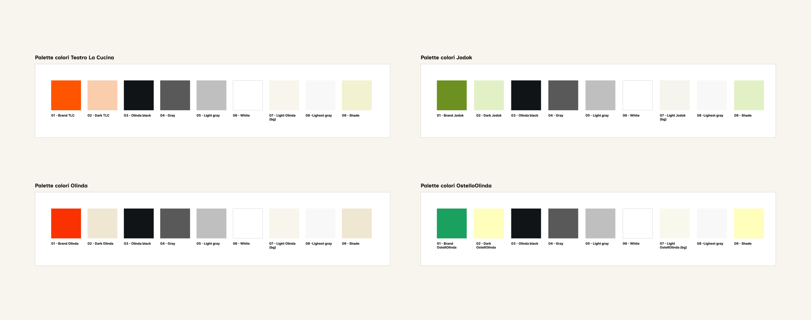
To avoid the proliferation of redundant stylesheets, we created a system of custom properties (CSS variables). This approach allows the theme core to remain unique, while the visual identity (colors, fonts, graphic assets) changes dynamically based on the class applied to the body of each site.

This architecture allowed us to centrally manage two fundamental aspects of the visual identity:

  • Atomic identity: each site defines its own palette and typography (e.g., Unica One for the theater, Inclusive Sans for the hostel);
  • Asset management: Carlo Gazzi’s modular illustrations are called via CSS variables, ensuring that each component (CTAs, dividers, signatures) loads the correct iconography for that specific context;

Content circulation: REST API and cross-site distribution

In an integrated ecosystem, information must not live in isolated silos. We developed an asynchronous content distribution system that allows the various sites in the network to communicate without weighing down the database.

A standout use case is the “What’s happening at Olinda” module. Through a custom integration of the WordPress REST API, we fetch news and events in real-time from the main site and distribute them across other touchpoints (Jodok, TeatroLaCucina, OstellOlinda).

The JavaScript implementation allows content to be filtered based on temporal relevance directly on the client-side, ensuring that the user sees only active initiatives while maintaining high performance during page rendering.

Operational efficiency: thanks to this architecture and the simplified management nature required by a Voluntary Organization, the workflow is streamlined to the essentials: the team publishes content once, and it is automatically propagated throughout the ecosystem, minimizing staff effort and ensuring information is always up to date.

Scopri altri casi studio

Il trimarano di Giovanni Soldini in partenza da La Spezia.

A sustainable digital project for the health of seas and oceans

A cultural e-commerce platform blending books, records, courses, and more