A cultural e-commerce platform blending books, records, courses, and more
UX and UI: merging two identities into a single digital experience
VolumeBK was born from the merger of SpazioBK, a historic independent bookstore in Milan, and VolumeVolume, a landmark shop for music lovers. The project’s goal is to represent a new cultural reality, both physical and digital, capable of integrating books, records, concerts, and activities into a single e-commerce ecosystem powered by WordPress and WooCommerce, built on the proprietary Flying technology infrastructure by PaperPlane.
Request
To unify two separate e-commerce platforms and two distinct souls into a single, coherent, recognizable, and scalable experience—optimizing user flows, navigation, and the product offering without losing the individual identity of each entity.
Result
A flexible, experience-oriented e-commerce platform that reduces cognitive load and guides users through the discovery of books, records, and events, mirroring the feel of a single, unified physical space.
Analysis
Analysis and strategy: merging two worlds into a single digital experience
The project began with an in-depth analysis of the SpazioBK website, not only because it was the more digitally structured of the two entities, but because it offered the opportunity to clearly distinguish what was working from what, over time, had lost its effectiveness. In view of the merger with VolumeVolume, it was essential to understand which content and navigation items deserved priority and which, instead, could take a back seat or be repositioned more strategically.
Data-Driven Design: behavioral analysis and user mental models
Through quantitative and qualitative data, heatmaps, and session recordings, we analyzed how people searched for books, how they moved between categories and filters, and where they encountered friction in the experience. At the same time, we studied the world of records and music, analyzing VolumeVolume’s main competitors to align market expectations with user mental models.
This double level of analysis allowed us to identify touchpoints between the two sectors and design a common structure capable of working for different types of content while maintaining consistent flows. The UX strategy was based on a key principle: offering different experiences for each product type, while providing recognizable and familiar paths for the user.
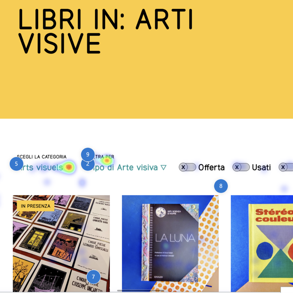
Visualization of user interactions via heatmaps on the filter area.
The “Filter by” label on the Spazio BK website creates ambiguity: some users interpret it as a button to open the filter menu.
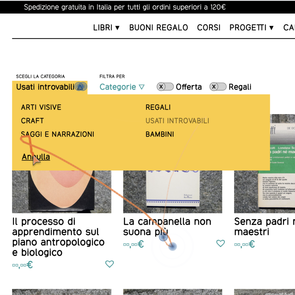
Open filter menu remaining visible over the product grid.
Session recordings (Clarity) show that some users try to close the menu by clicking outside of it, expecting a behavior that was not supported on the Spazio BK website.
UX
Simplifying complexity
In the transition from two distinct entities to a single e-commerce platform, the main UX challenge was managing complexity without increasing cognitive load. The analysis of SpazioBK and the comparison with VolumeBK’s new scope of offering highlighted two priority areas for intervention: search filters and navigation.
Observation of real user behavior, through data collected with Clarity and direct feedback from the SpazioBK physical store, revealed two main issues regarding filters. On one hand, interaction difficulties: it wasn’t always clear how to use them correctly. On the other, difficulty understanding topics, which made it complex for users to find content based on their interests.
Clearer filters for a more natural search
Unclear filters and interactions that didn’t align with user expectations made searching more tedious than necessary, especially in a context destined to include records, events, and new product categories.
This led to a complete redesign of the filters, engineered to make searching more natural and conversational—closer to how someone would ask for advice in a bookstore or shop. The language was made more descriptive and interaction areas more prominent, improving immediate understanding of what can be found within a category. The structure was simplified, removing redundant elements and highlighting only what truly supports the decision-making process.
Business-oriented, functional, and flexible navigation
In parallel with the work on filters, the analysis of page performance and user navigation paths guided the design of the new VolumeBK site architecture. The goal was not simply to redesign the existing navigation of SpazioBK or VolumeVolume, but to synthesize them into a single structure capable of representing the new brand, prioritizing business areas and minimizing non-strategic items.
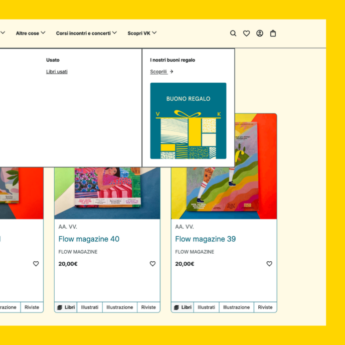
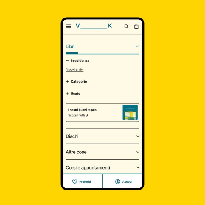
The study of less-consulted content, combined with an analysis of the record and music world, led to a more essential navigation focused on books, records, and events. This is supported by spaces designed to adapt to different times of the year and commercial needs. In this context, the “Featured” (In evidenza) section was created, designed as an editorial and business tool capable of highlighting specific products, initiatives, or content—such as gift cards during the Christmas period or upcoming concerts.
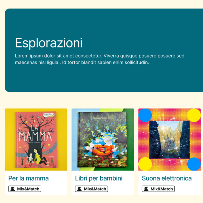
Alongside the main areas, the “Explorations” (Esplorazioni) section also takes shape: a transversal space with a dual function: to streamline the main navigation and, at the same time, tell the story of VolumeBK’s hybrid identity. Here, books and music meet in shared thematic paths, creating a touchpoint between the two souls of the project and offering the user a guided discovery experience that is more editorial and less didactic.
UI
A recognizable yet functional aesthetic
The UI of VolumeBK, developed in collaboration with Lorenzo Cravero, draws from SpazioBK’s historic visual elements—such as the square image format—integrating them with the new brand identity to build a fresh and contemporary interface.
Specific attention was also dedicated to the filter UI, making interaction areas more explicit and states more readable. The design guides the user through the search process, reducing visual ambiguity and reinforcing the understanding of possible actions.
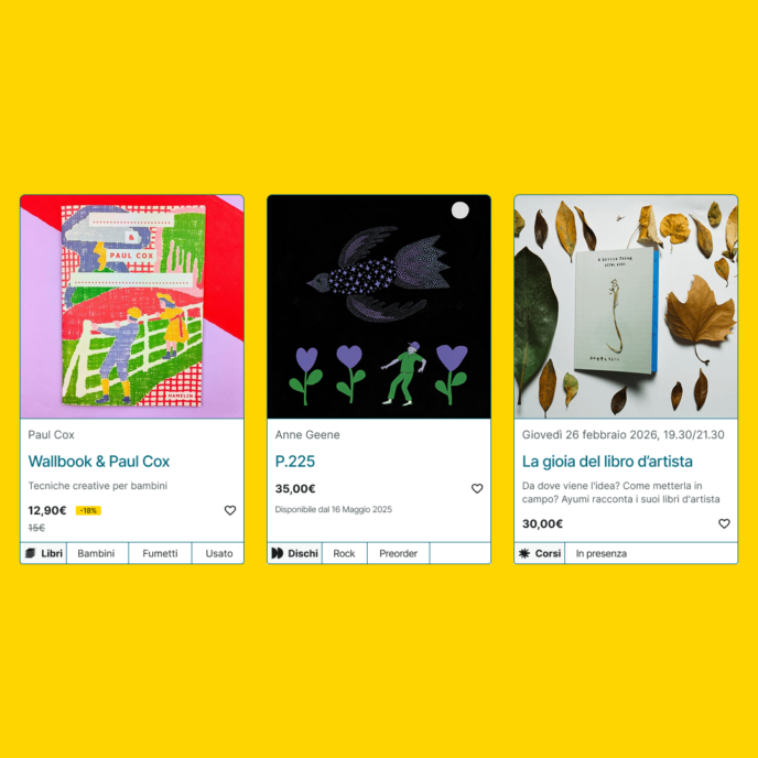
Visual hierarchy and clarity: information architecture in product cards
Particular attention was paid to the product cards, designed as a flexible system capable of adapting to books, records, events, courses, and all e-commerce categories. Each card organizes information in a clear and hierarchical way, helping the user immediately understand the type of content and its semantic placement within the catalog.
The rational design of the cards deliberately contrasts with the more expressive soul of the interface, creating a balance between usability, identity, and visual character.
WooCommerce
The JSON search system: speed and strategic precision
Unlike traditional WordPress search, which queries the database for every request, this system utilizes an architecture based on a static, compressed JSON file. Data from over 12,000 products is processed, filtered, and saved into this dedicated index to ensure an instantaneous and fluid user experience.
1. Upstream data optimization
The true added value lies in data preparation. The JSON file is not a simple copy of the database, but a selective index built to maximize relevance right from the source:
- Selection of relevant fields: A function acts as a filter, extracting information only from each product’s most significant fields—such as title, description, and availability—while eliminating irrelevant data.
- Manual keywords: The system includes a specific field for site managers to insert synonyms, variants, or terms, providing an editorial assist to the search results.
- Taxonomy aggregation: The engine automatically aggregates names of authors, publishers, languages, and genres (scanning over 20 different taxonomies) into a single textual profile for each product.
- Cleaning and sanitization: Texts are stripped of HTML tags, residual entities, and code, ensuring the engine works exclusively on plain text.
2. Advanced search engine features
- “AND” matching logic: The system only displays results containing all searched words, drastically reducing irrelevant results.
- Morphological intelligence: The engine handles the nuances of the Italian language, understanding singulars, plurals, and irregularities (such as libro/libri) thanks to dedicated normalization rules.
- Dynamic scoring: Each result receives a relevance score; matches in the title or at the beginning of a string are given higher priority to appear first.
- Stock management: Products in stock are systematically shown before out-of-stock items, optimizing the commercial effectiveness of the search.
3. E-commerce advantages
- High performance: The system reduces database load and guarantees minimal response times thanks to two-level caching and file compression.
- Enhanced user experience: Suggestions appear instantaneously while typing, and the system supports full keyboard navigation via arrows and Enter.
- Scalability and management: Data generation occurs in batches to avoid server overload, and the system updates automatically whenever a product is modified.
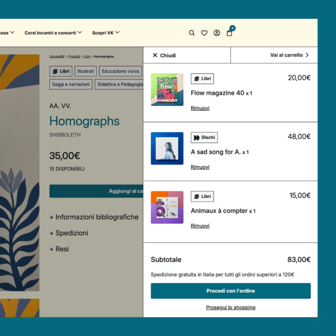
WooCommerce development and Core Web Vitals optimization
We optimized the site to be extremely fast on first impact, ensuring that main content (such as book covers) appears almost instantaneously. Technically, this translates into an excellent LCP (Largest Contentful Paint) score, which is essential for immediately capturing user attention and improving the store’s search engine ranking.
Another key strength is visual stability: while browsing products, the layout does not undergo sudden shifts. We worked to zero out the CLS (Cumulative Layout Shift), preventing buttons or text from moving while the page is loading. This guarantees a secure and professional shopping experience, eliminating the risk of accidental clicks while consulting the catalog.
Finally, the site stands out for its responsiveness to commands: every interaction, from clicking filters to adding items to the cart, receives an immediate response. By optimizing the INP (Interaction to Next Paint) parameter, we minimized browser waiting times, making the exploration of books, records, and courses as fluid and pleasant as a live visit to the physical store.
Infrastructure and hosting: the power of Kinsta
To support a catalog of over 12,000 items and traffic peaks related to events and editorial launches, we chose Kinsta as our hosting partner. The infrastructure based on Google Cloud Platform and the native integration of Edge Caching and CDN allow static content to be served with minimal latency. This setup guarantees an extremely low TTFB (Time to First Byte), providing the WooCommerce backend with the speed necessary to handle complex carts and secure transactions without slowdowns, even during massive search index updates.
Scopri altri casi studio

AroundTheBlue | Brand IdentityWebsitesStrategy
Gimme5 | WebsitesAccessibility