A sustainable digital project for the health of seas and oceans
A digital project for the challenge undertaken by Giovanni Soldini: sailing the 7 seas to report on the state of their health and what each of us can do to safeguard them.
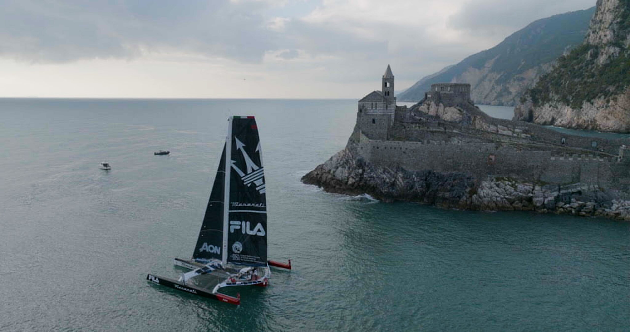
Aboard the Maserati M70, a state-of-the-art ocean-going trimaran, the renowned sailor Giovanni Soldini is embarking on a voyage around the world with the aim of monitoring and reporting on the state of health of the seas and oceans. PaperPlane was called upon to build the project’s identity and create the digital portal that tells the story of the journey and which will, in the future, become a benchmark for issues related to the health of the oceans and seas.
Request
Build an identity and a website capable of uniting the project’s three core pillars: the environment, the journey, and athletic performance.
Solution
A strong, high-impact brand identity that offers a contemporary take on maritime iconography, and a WordPress portal capable of bringing together countless contributions into an organic narrative.
The logo
A high-impact logo for a global call to action regarding an issue that concerns all of humanity.
A curve cuts through the typography, its arc tracing a horizon—a traveling companion to every navigator. At the same time, the angle of the curve gives the impression of looking at our planet from the outside. This creates a play of perspectives and viewpoints: first-person immersion recalls the romantic component of the journey; the external view evokes the scientific approach that lends authority to the voyage.
The bold, condensed typography lends an energetic tone to the communication and echoes the worlds of activism, sports, and politics in a global call to action that involves us all.
Brand identity
A brand identity inspired by the sea and its tradition
The curve theme also recurs in the visual identity system, becoming a visual element that masks images and videos, giving the impression of looking at our blue planet. The color palette was built by extracting colors from satellite photos of seas and oceans from all over the world. To illustrate the various themes featured on the portal, we designed a set of icons, using the curve from the logo as a design base. The icons are inspired by nautical tattoos and inherit their meaning, contextualizing it for the purpose of the narrative.


Motion graphic
An identity in motion, like the waves of the sea
The brand elements are a fundamental component of the various video contributions as well, where they come to life and provide informational support for what is shown through the visuals. The movements always use the curve as a base element and are inspired by the continuous motion of the waves.
UX & UI Design
The logbook 2.0
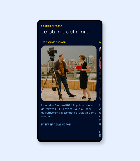
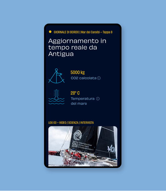
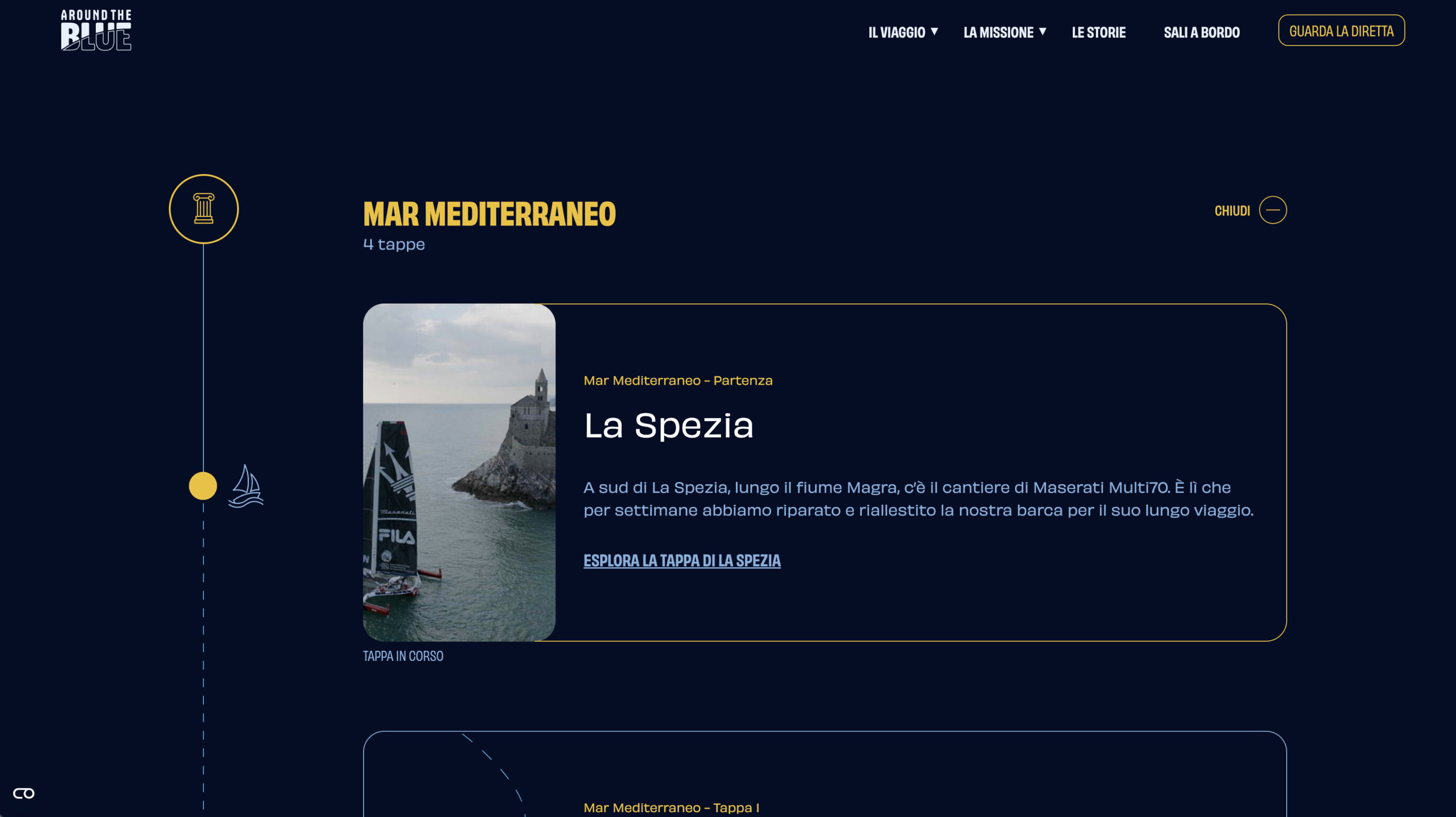
The journey undertaken by Giovanni Soldini and his team around the world is narrated through the pages of the site, designed to function as their logbook. The entire journey is told through stages, divided by Seas and Oceans, during which users have the opportunity to stop and read or watch in-depth content about the sea, the places they will navigate, and the changes the sea is undergoing in recent years.
Planet sustainability also depends on how we design a website
The digital project for Around the Blue aims to be “carbon neutral.” To contribute to the reduction of gas emissions, we used low-data-consumption components such as icons and illustrations to tell the project’s story. Furthermore, we decided to use a dark blue throughout the site that combines the experiential aspect (conveying the idea of “immersion in the deep sea”) with the functional one: less “light” used means longer battery life, which in turn reduces the electricity consumption needed to charge our devices, generating fewer carbon emissions.
Web development
The importance of web performance for a WordPress site that talks about sustainability
The AroundTheBlue website — built with a custom WordPress theme — was a challenge from a performance standpoint due to its numerous graphic and video elements. These assets, essential for making the storytelling more engaging, have a significant impact on both loading times and the amount of data transferred upon each page load.
To minimize this impact as much as possible, we used the SVG format for both purely graphic images and the icon font that characterizes the project.
Another element we focused on heavily is the video format: all clips in the WordPress media library are loaded on the front end using lazy loading. Videos — and their respective players — embedded via Vimeo are only actually loaded at the moment the user clicks “play.”
Scopri altri casi studio
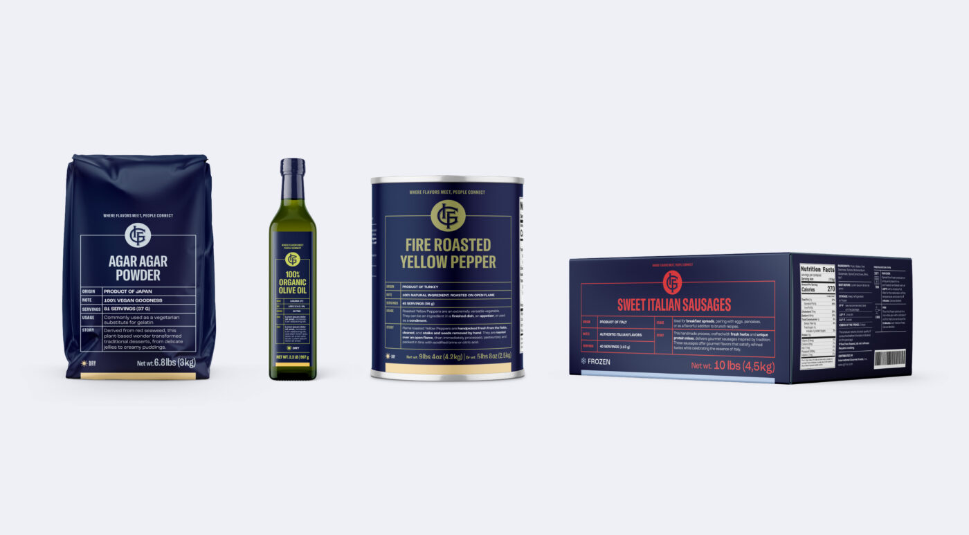
IGF | Brand IdentityStrategy
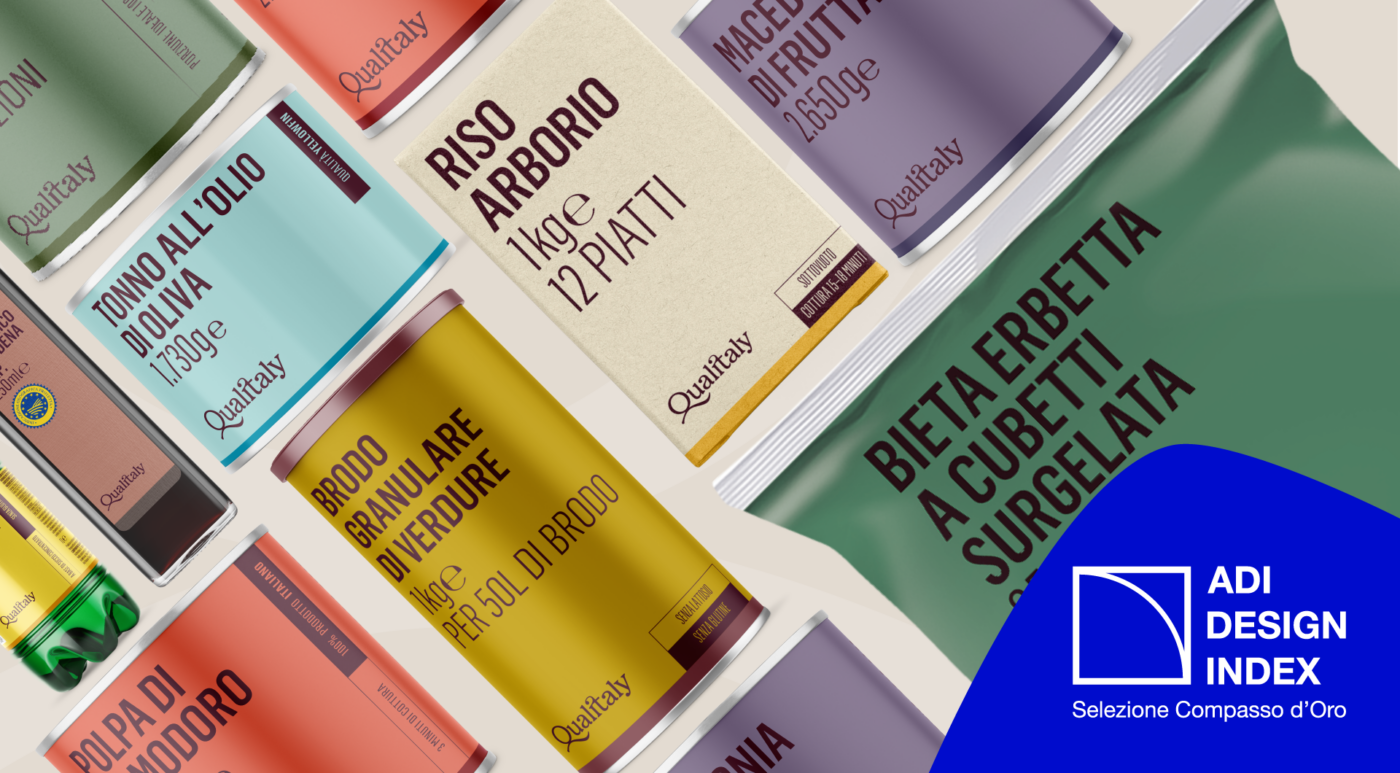
Qualitaly | Brand IdentityStrategy