IGF: Brand strategy and product identity for a private label in the US Food Service
IGF
IGF
IGF

Strategic relaunch for IGF’s proprietary line
IGF is a food service distributor based in North America, specializing in premium products for the foodservice and retail sectors. To relaunch its existing private label, the PaperPlane team was involved in an on-site strategic workshop at the company’s US headquarters. This co-design phase allowed for the definition of a new strategic direction, which subsequently translated into the development of an effective and functional visual identity for the entire packaging line.
The request
Reposition and relaunch IGF’s private label brand through a new strategy and a distinctive, versatile visual identity.
The results
A clear brand strategy with the customer at the center, featuring a visual identity designed to be functional, immediately recognizable, and easily adaptable to a wide and diverse range of packaging and product formats.

Brand strategy workshop
Strategic on-site workshop: co-designing through listening
To build a truly effective strategy, we started at the heart of the company: the people. We activated our Brand Strategy Workshop, a collaborative journey that allowed us to work side-by-side with IGF’s key figures — from the CEO and marketing team to the sales and procurement departments — in an intensive three-day workshop held directly at the company’s headquarters in the United States.
Through design thinking, design sprint, and gamestorming tools and methodologies, we facilitated team dialogue, aligned goals, and uncovered deep insights about the brand, the market, and their customers. An immersive experience that allowed us to create synergy with the company and lay the strategic foundations to relaunch their private label with a new vision.
During the workshop, we explored brand positioning, end-customer needs, and differentiating value levers, setting the stage for a solid and relevant brand identity.


Brand strategy
From research to strategy: identity and positioning
Once the workshop was concluded, we gathered and synthesized all the emerging insights, comparing them with data collected through questionnaires addressed to IGF customers. This dual level of analysis allowed us to validate the insights that emerged from the work with the internal team, focusing on perceptions, real market needs and expectations.
Based on this evidence, we defined the brand strategy for the private label, identifying its uniqueness and distinctive role within the North American food service landscape: a brand capable of building solid relationships throughout the supply chain, creating authentic connections between those who produce and those who cook.
IGF thus positions itself as a community facilitator through food, a bridge between territories, people, and culinary cultures. A brand that makes relationships its guiding value, translating it into an accessible, human, and reliable identity.
Brand identity
A functional, human, and narrative product identity
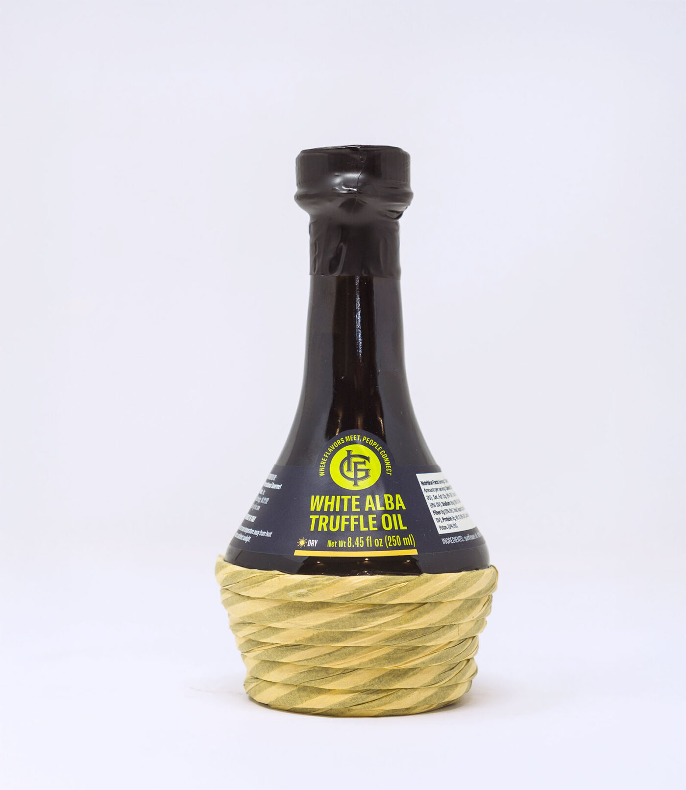
Starting from the defined strategic positioning, we designed a user-oriented visual identity: highly functional packaging, designed to meet the practical needs of the food service target, ensuring clarity, readability, and immediacy.
The front of the pack was conceived as a visual technical data sheet, capable of communicating at a glance all the fundamental product information — from type and origin to usage instructions.
But IGF is much more than a distributor. To highlight the work the company does alongside small producers, we integrated a space dedicated to the product story into the layout: a brief narrative that gives a voice to the origin of the ingredients, the people, and the territories that make them unique.
These stories reinforce the community value that IGF promotes through food, transforming every package into a bridge between producers and chefs, culture and the market.

A consistent and distinctive palette to strengthen the brand
All packaging shares a blue background, IGF’s corporate color, chosen to ensure visual consistency and strengthen brand recognition on shelves and in professional food service environments.
This solid and recognizable foundation is paired with a system of color accents applied to names and labels, designed to instantly identify the product category and the storage type (fresh, dry, frozen). A functional visual code that simplifies reference and improves the user experience for industry operators.


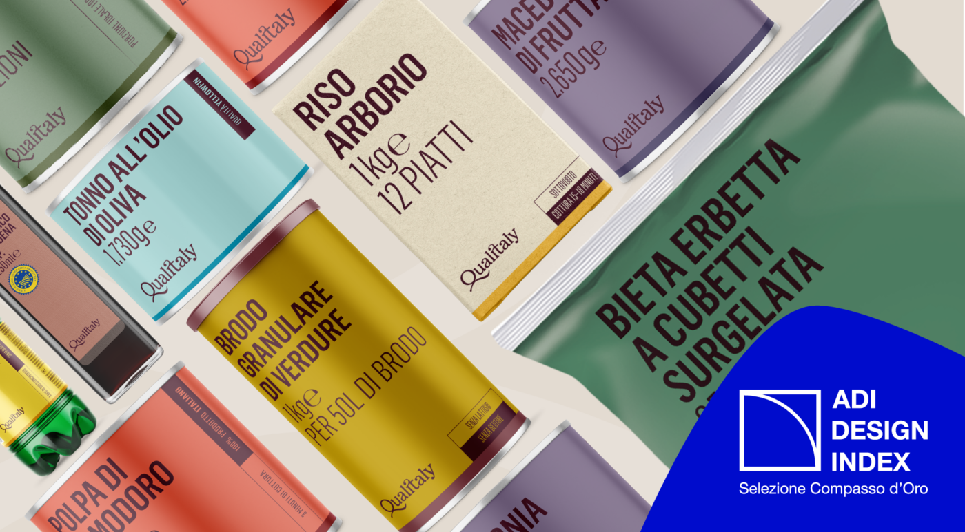
A flexible, consistent, and recognizable visual system
The brand identity was applied to a variety of packaging types that are extremely diverse in shape, format, and intended use. Despite this diversity, the visual system ensures uniformity, recognizability, and consistency across the entire product line.
Each pack maintains a strong visual identity, making it immediately associable with the IGF brand, while versatilely adapting to the specificities of each product. A balance between standardization and customization that sets the brand apart within the food service industry.


Operational manual
An operational manual to ensure continuity and autonomy
To facilitate the future management of the visual identity, we have gathered all the guidelines into a comprehensive operational manual.
The document provides clear and detailed instructions for creating labels, from the use of colors to space management, and even the inclusion of narrative content.
A tool designed to allow IGF’s internal graphic design team to continue the work independently, maintaining consistency and quality on every new reference.

Scopri altri casi studio

AroundTheBlue | Brand IdentityWebsitesStrategy
Qualitaly | Brand IdentityStrategy